Thoughts About Some Interesting Charts
By Neland Nobel
Charts, like photos, sometimes capture the mood of data. They also have a way of compacting history, so one can see differences or similarities to previous economic cycles.
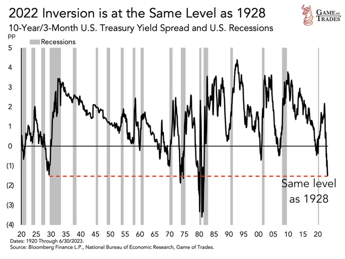
This chart shows the extent to which the “yield curve” is inverted. An inverted yield curve is caused when rates for short-term debt exceed the rates paid on long-term debts. This is abnormal. The more time there is on a loan, the more time there is for things to go wrong, like increased inflation or the chance of default. So longer-term debt should carry a higher interest rate than short term. That is not the case today. More importantly, note that since 1920 there are very few times the curve has been this inverted. The shaded areas on the charts are recessions. Note that when typically the relationship gets to zero or below, we have a recession. Currently, we are severely inverted and it is about the same level as it was in 1928, just before the Great Depression. Notice there have been only four occasions over the past 100 years we have been at or below the red dotted line. Given this history, do you feel there might be a reason for concern?
Above is a rather short-term chart that tells another but related story. With all the stimulus checks that were issued, and with the economy largely frozen by the ill-advised Covid Lockdown, consumers had increased cash reserves and little to spend it on. Therefore, household savings bulged, and that excess has been worked off as the economy opened back up. This pile of cash helped keep the “miracle consumer” spending on both goods and services. This seems to have delayed recession, which is normally predicted by the inverted yield curve explained above. However, the data now shows that this surplus of excess cash has now been largely worked off, which in turn suggests it will become more difficult in the next 12 months for the consumer to keep up the level of consumption. The consumer is responding by running up credit card debt at a record pace and will be paying extremely high interest rates to do so. Running down cash and going deeply into debt with expensive credit may lengthen the expansion, but history shows that this condition does not end well when the economy slows. Income is not guaranteed because employment is not guaranteed. But debt stays on the books and must be either serviced, refinanced, or defaulted upon.
The chart above is for households. Now, let us turn to the corporate sector. Corporations we are told, have plenty of cash. That is both true and misleading. The bulk of this cash is highly concentrated in the handful of giant tech companies that have been responsible for about 90% of the stock gains so far this year. That means while cash in the aggregate is high, it is not well distributed. Many weaker corporations will be forced to roll their debt forward and this chart shows that a huge amount of corporate debt must be refinanced just in the next few years. That would not normally be a problem but today, corporations must roll their debt forward into an interest rate structure that is twice as expensive as they previously were. Many of these corporations are only marginally profitable and do not have high-quality bond ratings. This chart suggests that real pressure will be put on the marginal borrower in the next few years. Just like consumer debt, corporations are not guaranteed profits but their debt stays on the books. It must be either refinanced, paid off, or defaulted upon. It would not be surprising to see a rising rate of corporate bankruptcies. There are early indications this process may already be underway.
Corporate bankruptcies are already up better than 23% so far this year. Just this past August set a new monthly record for corporate bankruptcy filings. This stress, of course, has the potential to spread. One corporation failing to meet its obligations to another can get both in trouble. And it goes without saying, corporations employ people and bankruptcies can lead to layoffs. Trouble in corporate finance, as we saw with regional banks, can accelerate and come out of seemingly nowhere.
Years of zero-interest rate policies have created a large number of distortions in the housing market. Housing is where the bulk of household savings resides. Rising interest rates are driving “housing affordability” to record lows. The combination of rising real estate prices and mortgage payments is pricing many people out of the market. People in those wonderful 3% mortgages cannot move, because it would cause their payments to more than double. This has frozen up “existing home” sales which are down about 17%. Existing homes are now more expensive than new homes, just constructed by developers. But among the worst distortions is the cost to rent is now way below the cost to buy. This could eventually cause prices for homes to sag or for rents to skyrocket. Notice too, whether it is causation or correlation, the last time this relationship was this severe was just before the last great housing bust.
The Leading Economic Indicators are a composite of “leading” indicators that historically have given advance (hence leading versus lagging) warnings of trouble in the economy. Again, please note the shaded areas are periods of economic recession. They now have been down 16 months in a row, much longer than normal before the recession actually arrived. This is the third longest period since 1960 so we are now in the extreme range of this reading. Only the crash of 1973-74 and the 2008 Great Financial Crisis have seen a longer period of negative LEI numbers. It is always possible we will see an exception to the rule, but with some of the other indicators we have just noted, to bet we will avoid a recession seems like a poor probability wager. However, as always, the timing of a recession is extremely difficult to predict.
While betting we will avoid a recession seems based on the data to be a poor bet, that is exactly the bet being taken by the vast majority of people. The positive action of the stock market, the willingness of consumers both to spend and run up credit card debt, and the popularity now of a “soft landing” outcome, suggest that most people are ignoring the implication of the charts previously shown. The stock market itself seems to behave as if recession is highly unlikely. It usually discounts the economy anywhere from six months to a year ahead, and its very positive story has many complacent. Our concern is that with so many people leaning into the optimistic outcome, they may not be prepared if they get surprised. And, they may be relying on an indicator (the stock market) that has been so distorted by a handful of giant tech companies, that it may be losing its predictive capabilities.
However, many Wall Street firms now doubt we will have a recession. One very prominent banking house (Goldman Sachs) now puts the odds at about 15%.
Whatever the case, we live in a strange time where the bifurcation between the stock market and bond market has never been worse (bonds have had the worst 4-year return on record) and the stock market also seems disconnected from some of our best predictive tools, such as the inverted yield curve and the Leading Economic Indicators.
Given the clash between some of these indicators and particularly the stock market market, it suggests one or the other has got it wrong.
What do you think are the indicators that have it right, and those that have it wrong?
Finally, we would be remiss if we did not mention oil prices. Oil prices are now back to where they were a year ago, over $84 per barrel. They are up about 30% just over the past few months, this despite the Biden Administration selling our Strategic Petroleum Reserve down to just 20 days supply, a completely irresponsible thing to do given the current war situation in Europe and the chance for escalation. Having reached such a low level, the SPR can no longer be used by the Administration to create short-term relief for consumers. Meanwhile, the same administration is doing everything to depress US production as they appear completely within the grip of environmental extremists who will not consider any no trade-offs with their anti-carbon agenda. Rising oil prices translate not into just the price of fuel, but that of plastics, and over 6,000 other products made from petroleum. Moreover, rising gasoline prices and diesel fuel raise the cost of agriculture and the cost of transporting goods. This adds to inflation and takes money out of the family budget which is already being squeezed by rising food, rent, and medical costs. The higher inflation goes, the more difficult it is for the Federal Reserve to back off from its interest rate increases. This all combines to make it even more difficult for the consumer to continue his spending spree, which has been supporting the economy.
Many now believe there will be no recession or that at worst it will be delayed. For many, it is a case of choosing whatever indicator best makes your point and helps you make the sale. We hope we are not guilty of that, and we are not selling anything. Notice we concentrated on things that really impact consumers: interest rates, available cash, oil prices, and housing. Consumer spending is 70% or more of GDP so what influences consumer behavior is important. Moreover, the charts above continue to suggest that the economy is not balanced right now and is flashing signals that in the past have been very reliable indicators. Caution continues to be warranted. We would rather be prepared for a recession, and not have one, than vice versa.
TAKE ACTION
As we move through 2023 and into the next election cycle, The Prickly Pear will resume Take Action recommendations and information.
This article is courtesy of ThePricklyPear.org, an online voice for citizen journalists to express the principles of limited government and personal liberty to the public, to policy makers, and to political activists. Please visit ThePricklyPear.org for more great content.